Platform Status
Contacting Support
Website Support
Integrated Vendors
Policies + Legal Documents
Security Policies
ADA Compliance
Supported Browsers
Privy and Website Speed
Submitting Feedback
Platform Status
How do I know if Privy is fully operational?
How do I know if Privy is fully operational?
Visit status.privy.com to get real-time information about the Privy platform’s operational status. Click Subscribe To Updates to receive alerts about any change in status.
Privy experienced an outage. What should I do?
Privy experienced an outage. What should I do?
In the rare event that Privy experiences an outage, the Status Page will be your best resource for any effects it may have had on your campaigns, emails, or text messages. The engineering team strives to resolve any issue in a manner that ensures proper deployment of your content and backfills analytics information. If this is not possible, additional information is sent to any affected accounts. If you’re uncertain of an outage’s impact on your account, please contact support.
Contacting the Support Team
How can I contact your support team?
How can I contact your support team?
The best ways to reach our support team are by either submitting an email ticket to support@privy.com or by using the Live Chat widget in the bottom left corner of your dashboard.
When is your support team available?
When is your support team available?
Live chat support is available from 10:30 AM to 6:00 PM EST, Monday through Friday.Email support is available from 9 AM to 6:30 PM EST, Monday through Friday.
Is phone support available?
Is phone support available?
Privy does not offer phone support; however, a Support agent may offer to jump on a call if your particular issue warrants it.
How can I contact each department?
How can I contact each department?
The Billing, Compliance, and Technical teams offer dedicated inboxes and email addresses. If you were provided information and are unsure where your request would be going, the team-specific addresses are as follows:
| Billing | billing@privy.com |
| Compliance | compliance_team@privy.com |
| DNS | domainservice@privy.com |
Website Support Policy
Initial install: Installation documentation is available for various platforms, and the Support Team will provide as much guidance as possible to ensure Privy is installed properly. However, the Support Team will not edit your site code directly. Instead, the team will refer you to your website platform’s support documentation or channels for specific questions about your site code. Website conflicts: Privy regularly invests engineering resources to ensure that Privy runs optimally on your website and does not interfere with common website functions. Please note that conflicts with site styling (CSS) and custom JavaScript (JS) are possible. The Support Team will do its best to help you identify these possible conflicts but will not edit your site code directly. Instead, the team will refer you to check with your website developer for a sustainable resolution.Integrated Vendor Policy
Privy integrates with many different platforms and services. The platforms that integrate with Privy typically provide their own support documentation that can be referenced should an issue arise. Privy will offer support around those integrations only as they relate to Privy-specific functionality. Additionally, issues resulting from your use of APIs or other code modifications may be outside the scope of support.Policies and Legal Documents
To reflect a constantly changing legislative landscape, Privy routinely updates the company’s various service documents. The most recent versions are linked below. Please review these documents to ensure that your business remains compliant while using Privy services. If you have questions about these documents, please email compliance_team@privy.com.Security Practices and Policies
See below for Privy’s current security practices and policies. If you believe you’ve found a vulnerability in one of Privy’s services, please see the Security page for responsible disclosure information.Application Development
Application Development
- Privy regularly deploys new features and improvements multiple times per week. All application code changes must pass multiple forms of human and automated review before deployment.
- Extensive unit, integration, and static analysis tests are run against all changes before release.
- Production and development environments are always kept separate on physically distinct networks.
Software Vulnerability Patching
Software Vulnerability Patching
- Many of Privy’s software systems are automatically patched and updated on a rolling basis.
- Privy regularly tests and deploys patches for vulnerabilities in third-party software packages and has an automated alerting system for when new security patches are available.
Authorization + Access Control
Authorization + Access Control
Data Security + Encryption
Data Security + Encryption
- All data is encrypted at rest. Privy uses either a symmetric key encryption algorithm like AES-256-GCM or public-private key encryption with a key size of at least 1024 bits.
- All data is encrypted in transit. Privy data is accessible only via TLS, using a minimum of TLS 1.1. It is not possible to access services without HTTPS.
- Privy.com enforces HTTP Strict-Transport-Security (HSTS), and all subdomains are on the HSTS preload list.
- The Privy.com domain is signed with DNSSEC.
- All passwords are salted and hashed with one-way encryption.
- Application credentials are stored separately from the codebase.
Data Residency
Data Residency
- All customer data is stored in the continental United States.
- Privy’s content delivery network may serve static assets worldwide but does not store customer data.
Datacenter Security
Datacenter Security
- Physical data center security is managed by Amazon Web Services, which has achieved the highest level of certifications, including ISO 27001 and SOC. For more information, see AWS Security and AWS Compliance.
Uptime, Reliability, and Recovery
Uptime, Reliability, and Recovery
- Privy constantly monitors its service for performance and availability. When issues are reported, they will appear on the Status Page.
- All application and customer data are stored on redundant infrastructure across multiple availability zones to eliminate single failure points.
- Customer data is backed up nightly and retained on a rolling basis to recover in the event of a disaster.
ADA Compliance
The Department of Justice (DOJ) published the Americans with Disabilities Act (ADA) - Standards for Accessible Design in September 2010. These standards state that all electronic and information technology must be accessible to people with disabilities. Privy strives to stay compliant and is making changes to become more ADA-compliant to enable all who interact with Privy displays to navigate them easily. The following Privy display types are considered dialogs or modals for ADA compliance:- Popups
- Flyouts
- Banners
- Spin-To-Win
- Thank You Displays
Note: Bars, embedded forms, and landing pages are not considered dialogs or modals.
- Site visitors can identify your Privy display as a separate modal, focus on the text in the display, and close the display.
- Site visitors can use the tab button to navigate the display’s elements (e.g., text, form fields, buttons).
- Written context is given to identify and clarify the form fields (e.g., email, phone, text, etc.).
- Site visitors can interact with or select answers to different forms or buttons/links (checkboxes, radio buttons, buttons, and links).
- Privy continues to strive for further compliance and will be continuing to make improvements to become more compliant. If you have further questions about this, please don’t hesitate to contact the Privy team at research@privy.com.
Compliance tips for your design
Compliance tips for your design
Users, including users with visual disabilities, must be able to perceive the content you are showing. WCAG requires “at least 4.5:1” contrast, where contrast measures the difference in perceived “luminance” or brightness between two colors. Below is an excerpt from WebAIM (Web Accessibility in Mind) that shows four examples with the minimum 4.5:1 contrast requirement for WCAG compliance. Privy recommends you meet or exceed the following for contrast and color in your onsite displays and email designs.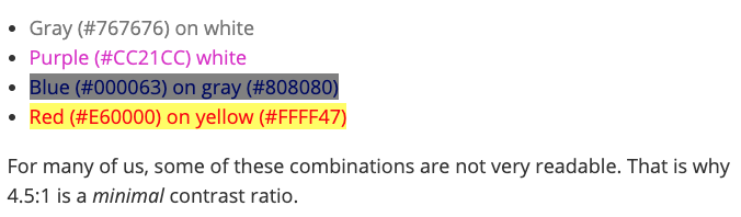
Supported Browsers
A supported web browser is required to utilize Privy’s full set of features properly. Some features might not behave as expected if you are using Privy on an older or unsupported browser.Note: These requirements apply to the use of the Privy platform and your public-facing content. The browser and email client support for content created in and hosted by Privy will vary depending on the HTML, CSS, and JavaScript used in your emails or on your website.
Windows-supported Browsers
Windows-supported Browsers
- Google Chrome (latest version)
- Mozilla Firefox (latest version)
- Microsoft Edge (latest version)
Mac-supported Browsers
Mac-supported Browsers
- Google Chrome (latest version)
- Safari (latest version)
- Mozilla Firefox (latest version)
Privy and Website Speed
Most users do not see a noticeable impact on their site performance when Privy is installed. This is because Privy aims to remain as lightweight as possible regardless of your installation method. That said, Privy offers both synchronous and asynchronous code options to provide the best compatibility with your site, and these code formats impact site performance differently.Optimization + hosting
Optimization + hosting
The Privy engineering team is constantly working to optimize the load times and file sizes associated with the widget used to display your Privy displays. Additionally, each iteration of the widget references assets in a world-class content delivery network (CDN) with an average response time of under 10 milliseconds. To learn more about the benefits of a CDN, click here.
Installation method
Installation method
Synchronous code - This is the recommended option for a manual install of Privy. Synchronous code is executed in sequence wherein each statement waits for the previous statement to finish before executing. This code format allows the installer to determine the relative order of code execution on their site, which means Privy could load faster or slower based on the site’s configuration. Asynchronous code - This is the default option when Privy is installed on your site via an integration such as Shopify or Wix. This code format yields to your site, loading as passively as possible, always giving your site precedence. It does not block any content or scripts on your page from loading. This means Privy’s assets are not placed on the critical render path for your site. While web page analysis tools may show that Privy loads later than other resources, this is entirely intentional.
How can I evaluate Privy's impact?
How can I evaluate Privy's impact?
To review and better understand Privy’s impact on your site performance:
- Using Google Chrome, navigate to a site page that includes the Privy code.
- Open the browser’s DevTools by pressing Control+Shift+J (PC) or Command+Option+J (Mac).
- Switch to the Network tab and then reload the page.
- As the page loads, the tab will populate with information. Each row represents a resource. By default, the resources are listed chronologically.
- Locate the Widget.JS resource to review its information. The most relevant information concerning performance is Status (Did the widget load properly with a 200 OK?), Time (How long did the widget take to load?), and Waterfall placement (When did it load? Did it allow other more important resources to take precedence?).
Submit Feedback to Privy
Customer feedback is invaluable at Privy. While our team members are the ones developing, selling, and supporting the software, our customers are the ones using the tools to attract millions of leads, generate billions of dollars, and build successful businesses.How is feedback used?
How is feedback used?
Getting customer input throughout the development process is very important as it is one of the best ways to ensure that product changes add value for real customers. More specifically, customer feedback is reflected in three primary ways:
- Fresh ideas and fixes - Customers frequently push the Privy product to its limits. The out-of-the-box thinking and creative workarounds used to make their lives easier and their operations more effective are perfect opportunities for improvement. Furthermore, as consistent users of the product, customers are keenly aware of issues that may be unknown or difficult to replicate and should be addressed in future updates.
- Validation for current initiative - The team here at Privy does their best to understand customers’ needs, but industry trends, research, and best intentions only go so far. Real, passionate customer feedback helps push the team forward or recalibrate when necessary.
- Start conversations - The Privy feedback options (see below) help the team identify customers with specific situations, challenges, or opportunities in need of additional exploration. These conversations help make the platform better for all users by driving development forward.
How can I share feedback?
How can I share feedback?